Earthy Neutrals with Muted Greens
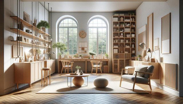
One of the most prominent trends in interior design color schemes includes earthy neutrals paired with muted greens. This combination draws inspiration from nature, offering a calming and grounded aesthetic that integrates well with various design styles. Neutrals like sand, taupe, and warm grays serve as versatile backdrops, while greens such as sage or olive introduce a soft contrast that feels fresh without being overpowering. These hues work particularly well in living rooms, bedrooms, and spaces where relaxation is a priority.
Designers often use this combo to highlight organic materials like wood, stone, and linen. The effect is both subtle and sophisticated, providing a balance between warmth and simplicity. Consider incorporating this palette in the following ways:
- Using sage green cabinetry against a backdrop of beige or off-white walls
- Layering olive green throw pillows on a taupe or gray sofa
- Choosing art or décor pieces that blend earthy tones with botanical motifs
This pairing supports a sustainable and biophilic design ethos, which continues to grow in popularity among homeowners and professionals alike.
Soft Blue and Burnt Orange
For those seeking a more vibrant yet refined look, soft blue combined with burnt orange creates a striking interplay of cool and warm tones. This duo brings a contemporary flair while maintaining a sense of comfort. Light blues evoke tranquility and openness, while burnt orange introduces energy and warmth, making it ideal for social or creative spaces like dining areas, offices, or reading nooks.
When using this color combination, it’s essential to strike the right balance. Too much orange can feel overwhelming, while an excess of blue might render the space too cold. Instead, use one color as the primary and the other as an accent. Ideas include:
- Painting an accent wall in burnt orange with soft blue furniture or textiles
- Incorporating patterned rugs or curtains that feature both hues
- Adding accessories like vases, lamps, or artwork that tie the palette together
This color pairing also works well with metallics like brass or copper, which enhance the richness of both tones.
Charcoal Gray and Dusty Rose
Charcoal gray and dusty rose create an elegant and modern palette that is both timeless and chic. The depth of charcoal provides a strong foundation, while dusty rose adds a hint of softness and romance. This duo is ideal for spaces where you want to convey sophistication without losing warmth, such as master bedrooms, formal living areas, or upscale home offices.
Designers recommend using dusty rose in textiles or wall art to avoid overpowering the space, while charcoal can be used for larger surfaces like walls, furniture, or cabinetry. Key applications might include:
- Charcoal accent walls with dusty rose curtains or bedding
- Gray upholstered furniture with rose-colored cushions or throws
- Combining both tones in abstract artwork or wallpaper designs
This color scheme pairs well with matte black or gold finishes, further enhancing its refined aesthetic.
Terracotta and Warm White
Terracotta and warm white is a comforting and timeless combination that brings warmth and brightness to any room. Terracotta, with its earthy red-orange hue, adds depth and character, while warm white keeps the overall atmosphere light and open. This pairing is particularly effective in Mediterranean, bohemian, or rustic interiors, where the goal is to create an inviting and grounded space.
Incorporating this combination can be done in several creative ways, such as:
- Using terracotta tiles or paint for focal points like fireplaces or backsplashes
- Pairing warm white walls with terracotta planters, vases, or textiles
- Layering natural materials like rattan, jute, and clay to complement the palette
This duo works well with other natural tones such as ochre, mustard, or forest green, allowing flexibility in evolving the room’s design over time.
Midnight Blue and Soft Beige
Midnight blue and soft beige present a dramatic yet calming color combination that suits both modern and classic interiors. Midnight blue offers a sense of depth and luxury, while beige tones soften its intensity, making the space feel both grounded and expansive. This palette is especially popular in bedrooms, dining rooms, and areas where a touch of elegance is desired.
To make the most of this combination, consider the following design approaches:
- Painting cabinetry or walls in midnight blue while using beige countertops or textiles
- Mixing navy blue furniture with beige area rugs or curtains
- Adding contrast with white trim or metallic accents to enhance visual interest
These colors work well with natural light and can be enhanced with textures like velvet, linen, or brushed metal to add layers of interest and sophistication.
Conclusion: Embracing Evolving Color Trends
Interior design color trends continue to evolve, offering homeowners and designers a wide range of expressive and functional palettes. Whether you gravitate toward earthy tones, bold contrasts, or soft elegance, there’s a color combination that can help bring your vision to life. The key is to select a palette that aligns with your space’s purpose and atmosphere, while allowing room for personal expression. By thoughtfully incorporating these trending combinations—such as muted greens with neutrals or midnight blue with beige—you can create interiors that feel both current and timeless.


